For the RESS (Realistic Equine Sculpture Society) finishwork contest this year I chose to make up "The Whole Enchilada Award" which (in part) addressed the bigger picture presented when photographing artwork. It can really make a HUGE difference. Granted, if its dishonest and makes your work better looking (hides common flaws), well then somewhere down the road it'll catch up to you when you don't have repeat business or word gets around. However what always seems like a crime to me is when I'm looking at a picture and it doesn't even remotely do justice to all nuances the work has that make it a delight.
In other words, hopefully the photos encourage the buyer to want to look more.
And I've been SO guilty of being really inept at getting good quality honest photos. I tend to wash out or over saturate color. Well I don't, this is how they come out on the camera card. I know there are light meters and tricks and such for this.. I have no clue how to use them. Once upon a time I was flirting with a very cute photographer who was taking shots around my company. ;) Anyhow, he made a most sincere effort to teach me how to use the light meter. Poor fellow just received a blank stare. I blame his good looks for distracting me but well -sighs- in all seriousness, it looked like quite the project and at the time I didn't own any camera period anyhow. I have 2 used cameras now that work pretty nicely at times but of course still no such equipment as light meters or specialty lights at my disposal... sooo witness my solutions to these issues.
Photoshop:

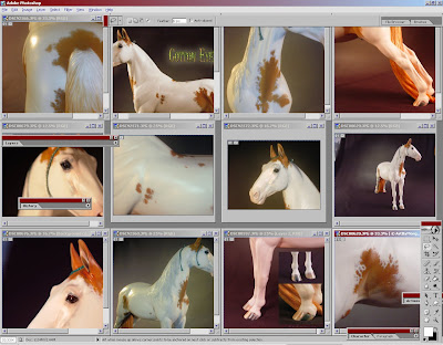
Check out the vast arrays of colors in the white alone give the various light changes and settings and how zooming in can affect these. It's nice to tile sometimes to compare your shots - especially if you're like me and keep going back to take more just to be certain you get it right on.
For instance, upper row pictures #1 (tail view) and #3 (chest view) were taking using my Nikon & it's "SLOW" flash setting. Basically all I gather about this is that the flash clicks and the aperture of the camera stays open longer to capture colors more richly. I could be way off base about how that works, it's really uninteresting to me (chuckles) actually. I like to appreciate nice photos and leave some "wonder" to it. Anyhow, I mention this setting because I find it works exceptionally well for whites but tends to impart this surreal quality to the whole picture with adding a lot more neutral coloration to define the shape which tends to look almost line-drawn.
Good for dramatic photography, but in my humble opinion it could scare buyers by leaving them thinking you photoshop your pictures past what's honest. So for sales photos I've tried to show a variety of settings beyond this. White heavy colored horses really come out nicely with this slow-flash setting though.. if perhaps too saturated in the other colors.
Back to the photoshop tiled view above, in a 3/4 front view, on the 2nd row, the 4th picture over (showing the edge of the backdrop)... is a rather honestly colored shot in his white portions, and I like it quite a bit.. however the color in his tail came out a neon dayglo or safety vest orange color. -sighs- This is what I strive to correct in photoshop. I do occasionally actually go get a color chip (pantone color cards? anyone have them?).. and get a good approximation of the color for me to have here at the computer for reference (the horse is carefully tucked away now).
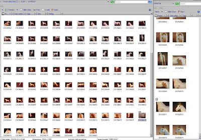
Anyways, it wasn't a really monumental post here but I figured I'd just document some of my fun. :) Below shows the 2 camera card's contents - actually isn't that much for this horse this time. With some colors I've been known to take 2x as many just to use every concievable lighting possible to highlight what's there.

So there you have it. Some lunch time thoughts on photo shoot fun and games. (I really soo soo do not know what I'm doing there so feel free to offer me any tips/suggestions..). I'm not in the market for new equipment though. ;)

No comments:
Post a Comment